

Good design and effective design are not the same thing
A website can look stunning in an agency portfolio and still fail to generate a single enquiry. Equally, a simple, unfashionable site can consistently outperform it on conversions. The difference is not subjective taste. It is whether the design is doing a job or just occupying space.
Effective website design is not about trends, awards, or personal preference. It is about moving the right person toward the right action as efficiently as possible.
Design is a communication tool, not a decoration
Every visual decision on a page communicates something. Font size signals importance. Whitespace signals quality and breathing room. Colour directs attention. Button placement determines whether an action feels natural or forced.
When these decisions are made intentionally around the user's journey, the result is a site that feels effortless to navigate. When they are made based on aesthetics alone, the result is a site that looks polished but leaves visitors unsure what to do next.
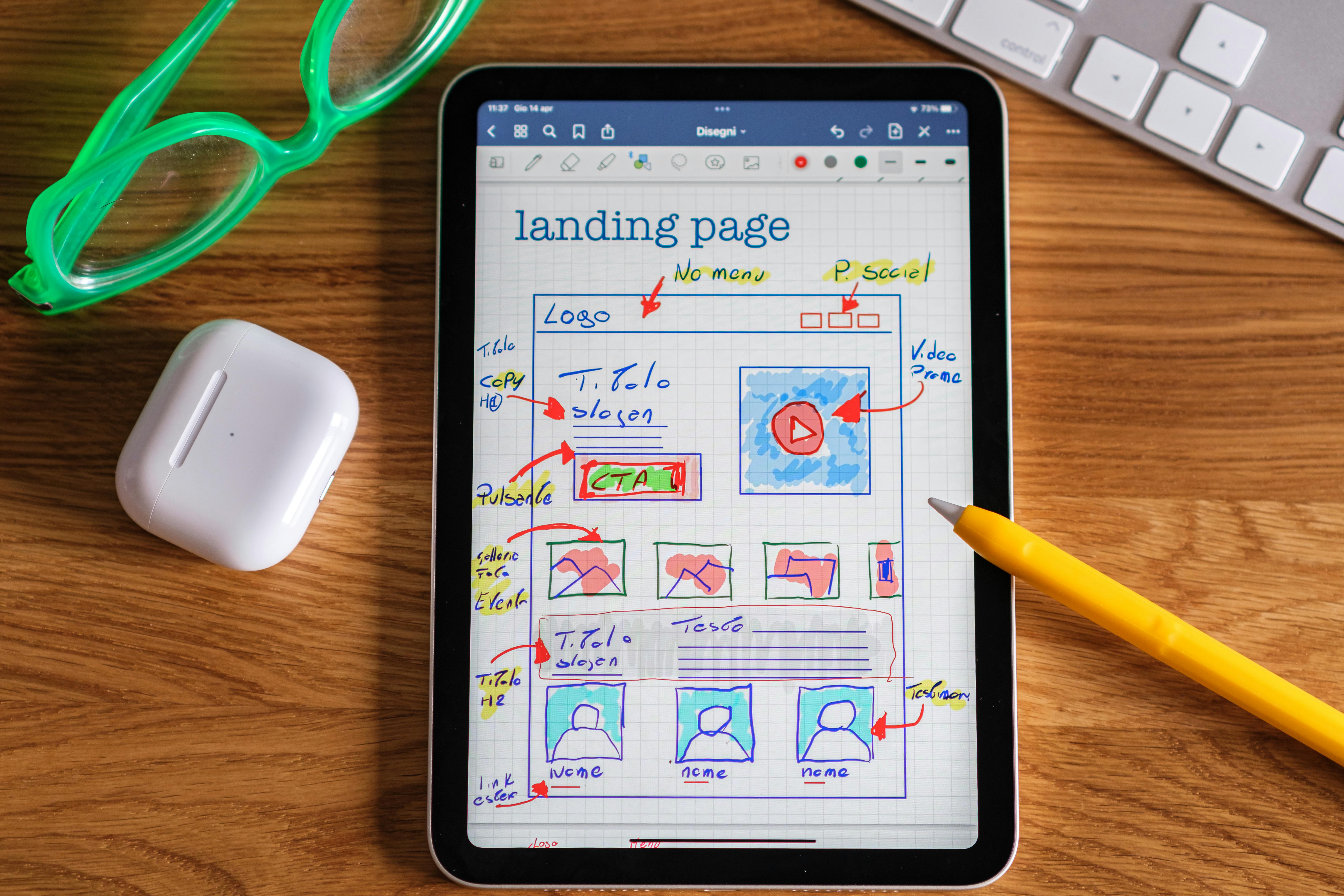
The elements that separate performing design from pretty design
Visual hierarchy that guides rather than overwhelms
A visitor landing on your page for the first time has roughly five to eight seconds before they decide whether to stay or leave. In that window, the design needs to communicate who you are, who you help, and what they should do next — without them having to work for it.
Strong visual hierarchy means the most important information is unmistakably prominent. Headlines earn their size. Calls to action stand out without screaming. Secondary information supports rather than competes.
Consistency that builds subconscious trust
Inconsistent design — mismatched fonts, varying button styles, different spacing patterns across pages — creates a feeling of unreliability that visitors cannot always articulate but absolutely feel. Consistency across every page signals that the business is organised, professional, and trustworthy.
This is not about rigid uniformity. It is about a coherent design system where every element feels like it belongs to the same family.
Mobile design that is built first, not retrofitted
More than half of UK web traffic arrives on mobile. A design that was built for desktop and then squeezed into a smaller screen is never as good as one that was considered for mobile from the very start. Tap targets too small to press, text that requires zooming, and forms that are painful to fill in on a phone are not minor inconveniences. They are conversion killers.
Speed as a design decision
Loading time is part of the design experience. A beautifully designed page that takes four seconds to appear on mobile has already lost a significant portion of its audience before a single pixel is seen. Design choices — image formats, animation complexity, font loading — all affect speed and should be made with performance in mind from the outset.

What to ask when reviewing a website design
Before signing off any design work, these questions are worth answering honestly:
- Is it immediately clear what this business does and who it is for?
- Is there an obvious next step on every page?
- Does it work as well on a mid-range Android phone as it does on a large desktop monitor?
- Does the design reflect the quality and trust level the business needs to convey?
If the answer to any of these is uncertain, the design is not ready — regardless of how good it looks in a Figma file.
