

The element most businesses never think about is doing more work than almost anything else
When businesses review their website and decide something needs to change, they talk about colours, images, layout, and content. Typography is rarely mentioned. It sits in the background, invisible in the way that good infrastructure is invisible — noticed only when something goes wrong.
That invisibility is deceptive. Typography governs how readable your content is, how trustworthy your business feels, how much effort a visitor has to invest to extract information, and whether the personality of your brand comes through or gets lost in generic defaults.
Poor typography costs businesses leads every day without anyone in the business connecting the two things.
What typography actually means in web design
Typography is not simply choosing a font. It is the complete system of decisions governing how text appears and functions across every page of a website. This includes the choice of typefaces, the sizes used at each level of the content hierarchy, the line height that determines breathing room between lines, the spacing between letters, the maximum width of text columns, the contrast between text and background, and the consistency with which all of these are applied.
Each of these decisions either makes text easier or harder to read, and either reinforces or undermines the impression the business is trying to create.
How typography affects commercial performance
Readability determines whether your message lands
A visitor who finds text difficult to read will not push through it. They will leave. On mobile devices, where screen sizes are smaller and reading conditions are more variable, poor typographic decisions have an even more immediate impact on whether content gets read at all.
Text that is too small, lines that are too long, insufficient spacing between paragraphs, and low contrast between text and background all reduce readability in ways that directly affect how much of your message a visitor actually absorbs before making a decision about whether to enquire.
Typographic hierarchy guides the visitor through the page
Every page on a website contains information of varying importance. Headlines, subheadings, body text, captions, and calls to action each play a different role in the visitor's journey. Typographic hierarchy — the deliberate use of size, weight, and spacing to signal the relative importance of each level — is what allows a visitor to scan a page efficiently and find what they are looking for without having to read every word.
A page without clear typographic hierarchy forces the visitor to work. Every element competing for equal attention means nothing is easy to find. Visitors presented with undifferentiated walls of text consistently disengage faster than those presented with content that is easy to scan.
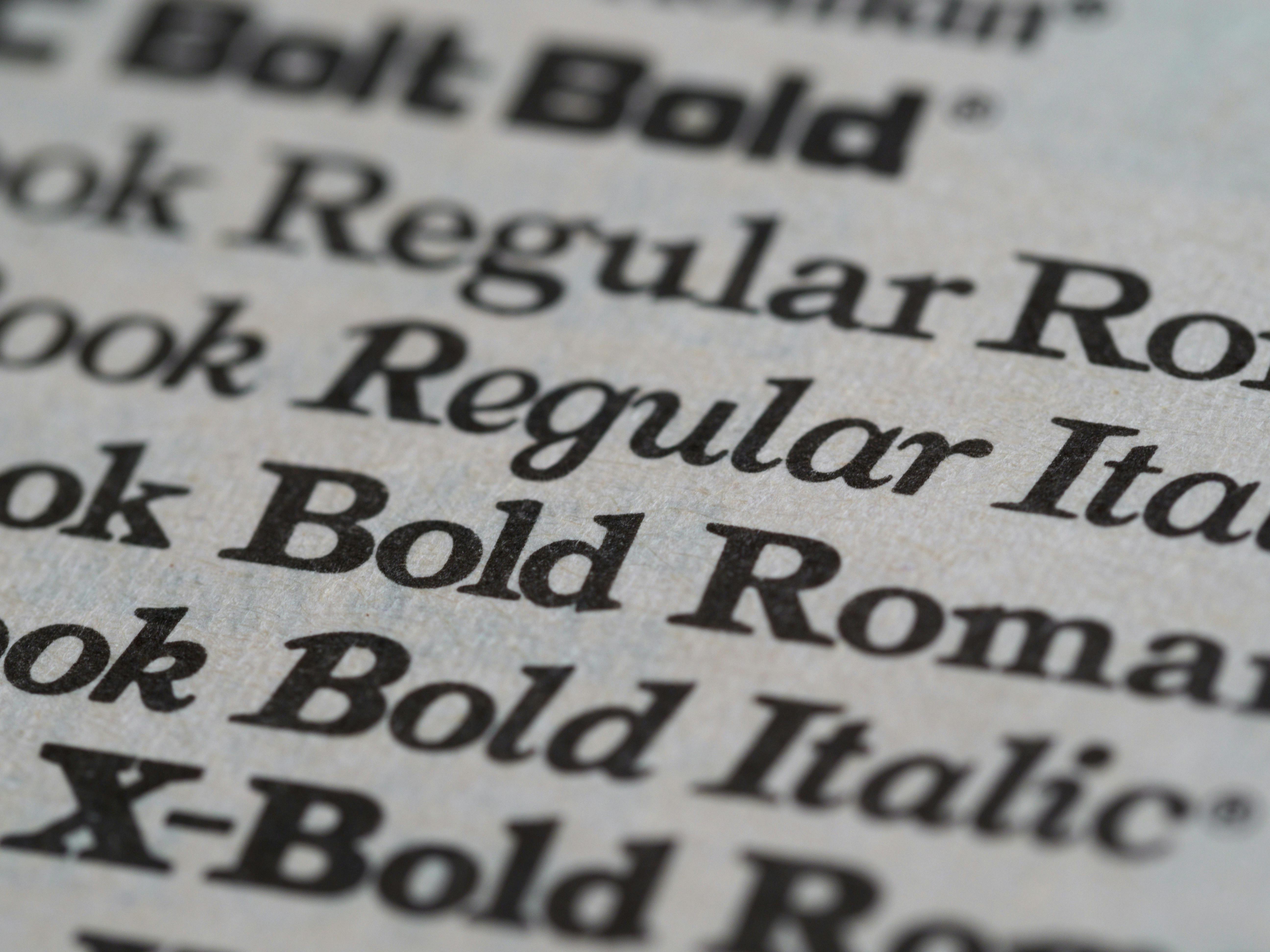
Font choice signals brand personality and sector fit
Typefaces carry personality. Serif fonts — those with small strokes at the ends of letterforms — carry associations of tradition, authority, and established credibility. They work well for legal, financial, and heritage businesses. Sans-serif fonts feel modern, clean, and accessible, making them the default choice for technology, healthcare, and contemporary service businesses.
The choice of typeface communicates something about the business before the content is read. A mismatch between font personality and brand positioning creates a subconscious dissonance that visitors feel without being able to articulate. A law firm using a casual rounded typeface, or a creative agency using a stiff corporate serif, both create the same vague sense that something is slightly off.
Consistency builds the subconscious sense of professionalism
A website where heading sizes vary from page to page, where body text is a different size in different sections, or where multiple competing typefaces appear without a clear rationale feels inconsistent in a way that undermines trust. It signals that nobody has been paying close attention.
Typographic consistency — the same sizes, the same weights, the same spacing applied reliably across every page — creates the subconscious impression of a business that is organised, considered, and trustworthy. It is one of the simplest and most effective ways to elevate how professional a website feels without changing anything else.
The most common typographic mistakes on business websites
Using too many typefaces is the most frequent issue. Every additional font introduced without purpose adds visual noise and reduces cohesion. Most websites need no more than two typefaces — one for headings and one for body text — chosen to complement each other and suit the brand personality.
Setting body text too small for mobile is another consistent problem. Text that reads comfortably on a desktop monitor at a desk becomes difficult to read on a phone held at arm's length in varying light conditions. Sixteen pixels is a reliable minimum for body text on mobile. Anything smaller creates an unnecessary readability barrier.
Insufficient line height is less obvious but equally damaging. Text with lines too close together feels dense and effortful to read. Adequate spacing between lines — typically one and a half to one point six times the font size — gives text room to breathe and makes sustained reading significantly more comfortable.
What good typography looks like in practice
A well-considered typographic system on a business website is largely invisible. Content is easy to scan, comfortable to read, and the personality it projects feels natural and consistent with the rest of the brand. Visitors absorb information without friction and move naturally toward the action the page is designed to prompt.

Achieving this does not require expensive custom typefaces or complex design systems. It requires deliberate decisions made at the start of a project and applied consistently throughout. Typography that has been thought about properly earns its place by doing its job without drawing attention to itself.